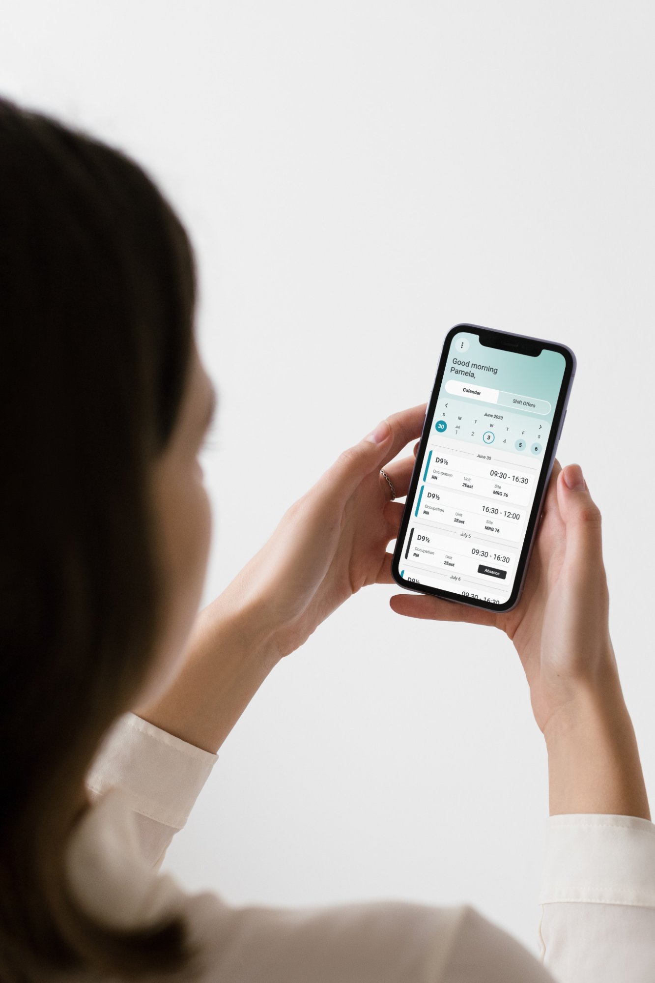
Project overview
LGI Healthcare Solutions is a Canadian company that has been building software for healthcare organizations for 40 years.
LGI Scheduling was one of the company’s key products: a desktop platform that helps managers and schedulers staff healthcare institutions, under complex union and collective-agreement rules. As the product designer in charge of it, I designed its mobile companion: an app that finally lets staff view and act on their own schedules.

What I owned
- Product visionShaped the app from the early stages of the LGI Scheduling product roadmap.
- Business caseBuilt the business case and drafted the product structure.
- User and market researchRan user research with client organizations and their staff, and owned the competitor analysis matrix to map market gaps.
- MVP definitionDefined the personas, key scenarios and requirements, and set the MVP scope with the Product Director.
- DesignDesigned the experience end to end, with accessibility built into the design system.
- DeliverySupervised production with the external development partner, including design QA.
LGI Scheduling: One system, two experiences
The mobile app runs on top of the desktop platform, sharing the same schedules and rules in real time.
For managers and schedulers. Manage the master schedules, rules, shift replacement and reports.
For nurses and healthcare staff. Manage and view their schedule, shift offers, leave requests and shift swaps.
The business case for a mobile app
LGI Scheduling covered only the management side: staff had no way to see or act on their own schedules, so that part of the journey was missing from the system. At the same time, the competitor analysis I built revealed new players offering staff self-service on mobile, and public healthcare clients were asking for a way to involve staff in scheduling and fill shifts faster. Building a mobile companion on top of the existing platform closed the gap, kept LGI competitive and answered a direct client need.
Main project objectives
Process
I led design from the first idea to production, working with my product team and an external development partner. I helped shape the app from the early stages of the LGI Scheduling product roadmap: I built the business case, drafted the product structure and ran the user and business research. I then designed the experience and supervised production with the external development company through to launch.
-
1
Discovery
Understand the market and the staff who would use the app.
- Market analysis
- User interviews
- Surveys
- Stakeholder workshops
-
2
Define
Turn findings into a clear scope and priorities.
- User persona cards
- Product roadmap
- User journeys
- MVP prioritization
-
3
Design
Shape the app from first concepts to final screens.
- User flows
- Low to high-fidelity design
- Product design system definition
- Interactive prototypes
-
4
Delivery
Bring the design to production with the build team.
- Validation testing
- External dev handoff
1Discovery – Listen to organizations and employees
Interviews with our clients showed two clear reasons behind the request: giving employees more visibility and control over their own calendar, and giving schedulers a more powerful tool to fill empty shifts. Sessions with nurses and schedulers at the healthcare providers confirmed the same need in their daily work.
Key pain points from client interviews
Interviews with healthcare organizations already using LGI Scheduling surfaced four recurring problems.
- Too many channels. Requests arrived by text, voicemail, email, notes and in person.
- Last-minute changes. Frequent short-notice requests and schedules changing every week.
- No transparency. Staff had little control over overtime, time off and extra shifts.
- Rules that can’t bend. Nurse ratios, seniority and maximum hours are fixed requirements.
Competitor analysis
How the main scheduling solutions in the Canadian market covered the staff side.
| UKG (Kronos) | Dayforce | symplr | Staff Schedule Care | LGI Mobile | |
|---|---|---|---|---|---|
| Mobile schedule view | |||||
| Shift swaps between staff | |||||
| Automated shift callout | |||||
| Canadian collective-agreement rules | |||||
| Built for healthcare | |||||
| French / bilingual |
Full Partial Not available · Summary of the market analysis, simplified.
2Define – Converge the research outputs
The interview findings were turned into four personas, one for each role the app had to serve, so every design decision stayed tied to real user needs.
Four personas, four different perspectives

“My schedule shouldn’t change the night before.”
NeedsA stable, fair schedule that respects her breaks and time off
FrustrationsUnanswered requests and overtime after long shifts

“Keep it simple. I don’t have time to learn a complicated app.”
NeedsCheck his shifts and request vacation without calling the office
FrustrationsPaper schedules on the wall; not very confident with apps

“I want extra shifts, but I always hear about them too late.”
NeedsPick up open shifts fast and swap shifts around his studies
FrustrationsOffers arrive by phone call when he can’t answer

“One sick call can take my whole morning on the phone.”
NeedsFill last-minute gaps fast while respecting collective agreements
FrustrationsCalling staff one by one; too many request channels
Key scenarios
- Picking up a last-minute shiftDaniel · Health Care Aide
A shift opens up tonight. Daniel gets an alert and bids on it with a swipe, right from the notification.
- Checking my weekEmily · Registered Nurse
Before a run of night shifts, Emily opens the app and sees her week, shift details and breaks at a glance.
- Requesting time offMarc · Cook, Food Services
Marc checks his vacation balance, picks the dates and submits the request, without calling the office.
- Covering a sick callJulien · Scheduler
A nurse calls in sick at 6am. Julien sends one offer to every qualified person instead of phoning them one by one.
1-year solution roadmap
The roadmap balanced three inputs: the priorities that emerged from user research, the company’s business goals and the technical constraints of building on the existing platform. Together they set the release order: schedule and shift offers first, then time off, then shift swaps.
3Design – A new mobile app
A simple, mobile-first experience designed around the daily reality of healthcare staff: quick to check, easy to act on, and always up to date.
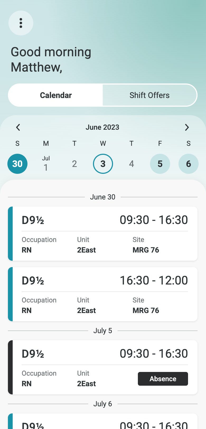
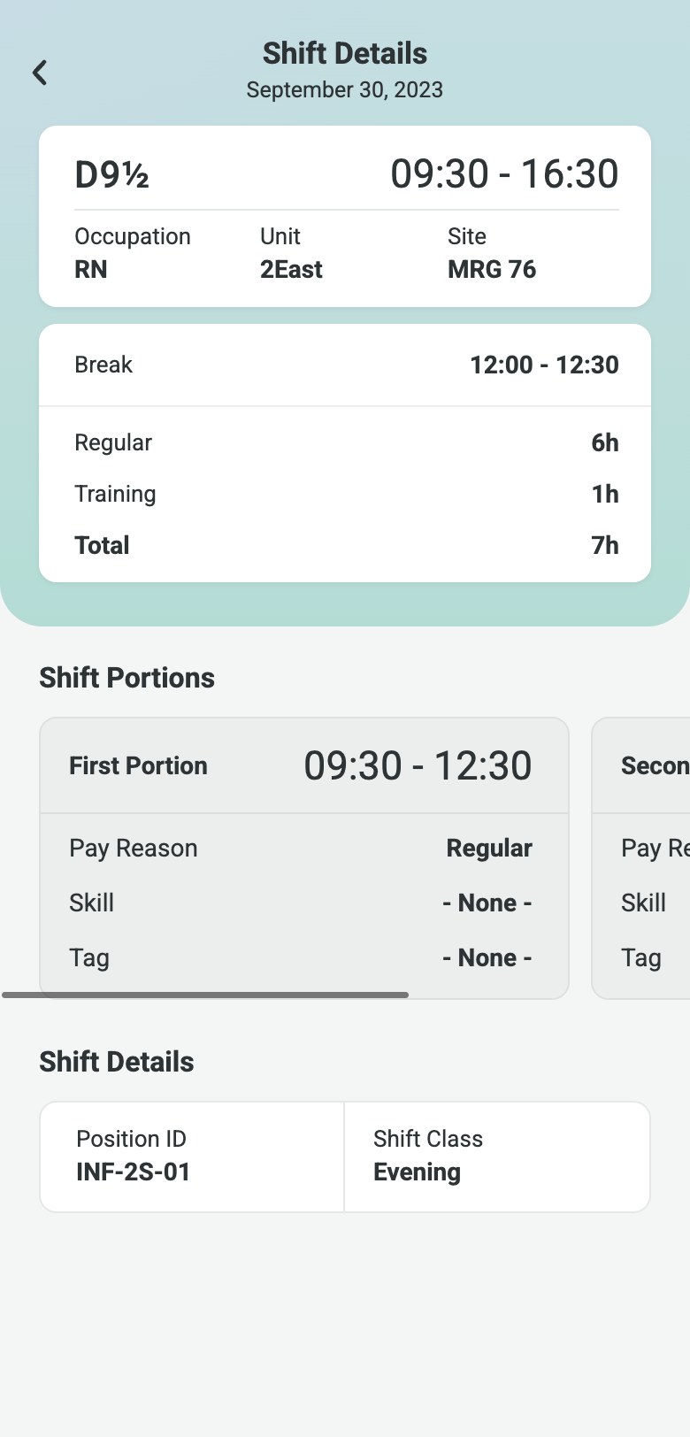
Everything staff used to ask a manager for, now is in their pocket.
- 01Real-time schedules & information
View schedules, worked hours, overtime, bonuses and vacation balances anytime, with fewer questions to managers.
- 02Vacation & leave requests
Request time off in a few taps and track approvals in real time.
- 03Autonomous shift management
Swap shifts, give them away or bid on open shifts directly from the app.
- 04Custom notifications
Push notifications on schedule changes and shift offers, wherever staff are.
Automated shift callout
The system finds the right people for a last-minute shift, sends them the offer and confirms the assignment, so schedulers no longer have to call staff one by one.
Scenario storyboard
1The scheduler finds a last-minute gap to cover
2A callout goes to the staff the system selected
3The nurse gets a new shift offer notification
4She opens the app and bids with a simple swipe
5The scheduler awards the shift by collective agreement rules
6The nurse is notified and sees the shift in her calendar
Pain points it solves
Schedulers contacted dozens of employees one by one to fill a single shift.
Shifts were sometimes offered out of order, breaking collective-agreement rules.
Offers used to arrive by phone, so nurses busy on shift often missed the call. Now every offer reaches them in the app.
Nurses now see every shift detail and how it fits their calendar before they bid.
Shift callout workflow
Swipes to accept
Flow detail-
1Offer received
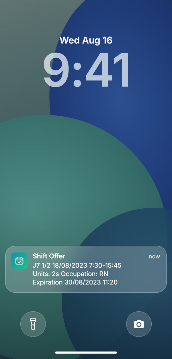
A push notification arrives, even on the lock screen.
-
2View shift offer details
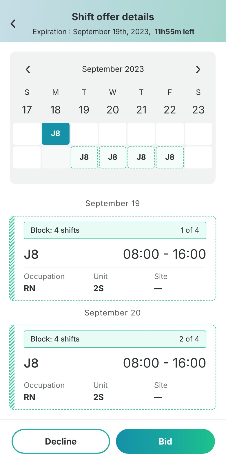
Open the shift offer details to check all the essential information before bidding on it.
-
3Swipe to bid
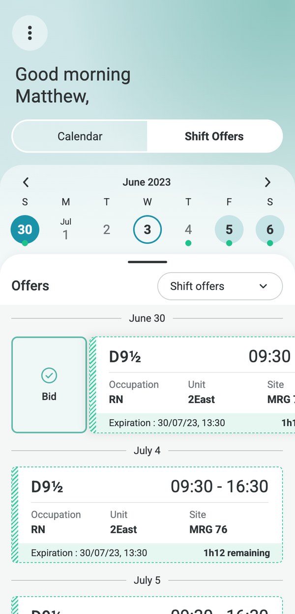
One swipe right on the card to accept the shift.
-
4Confirmed
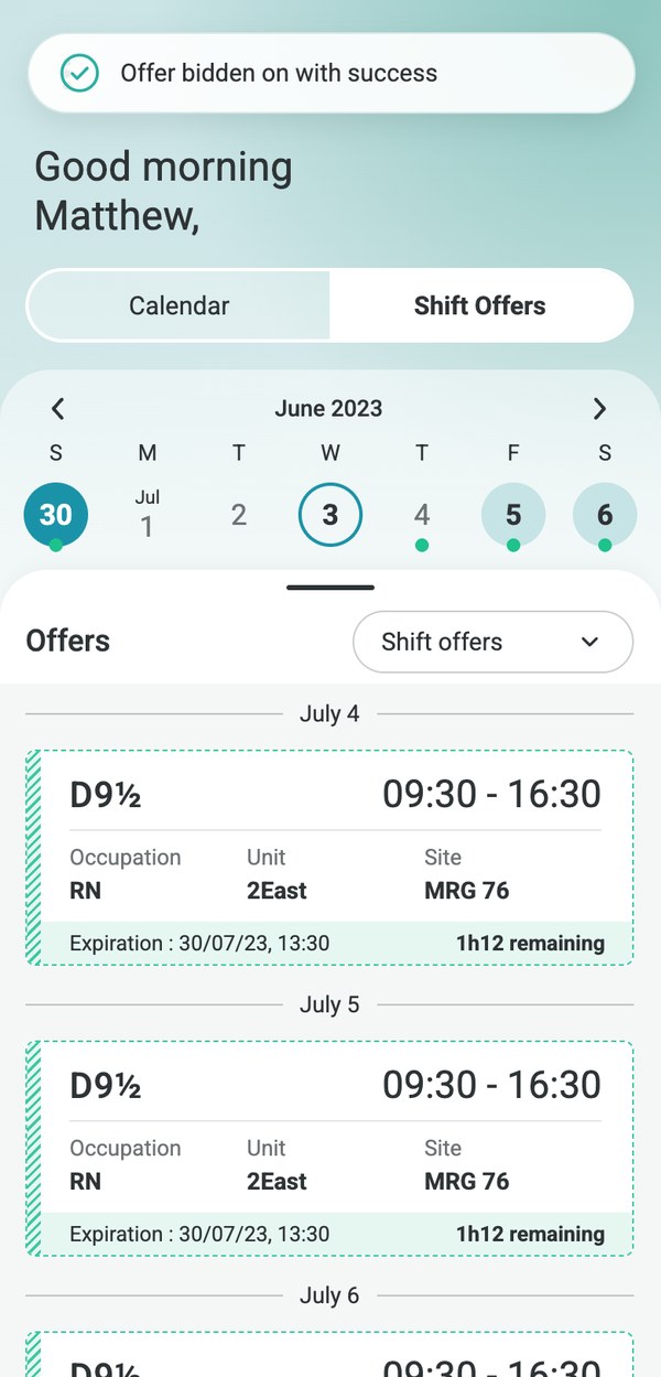
Instant confirmation, and the offer leaves the list.
One calendar for everything: shifts, leave and offers
Staff see their shifts, leave and open offers together in one calendar, so they can plan their time and decide on new shifts at a glance.
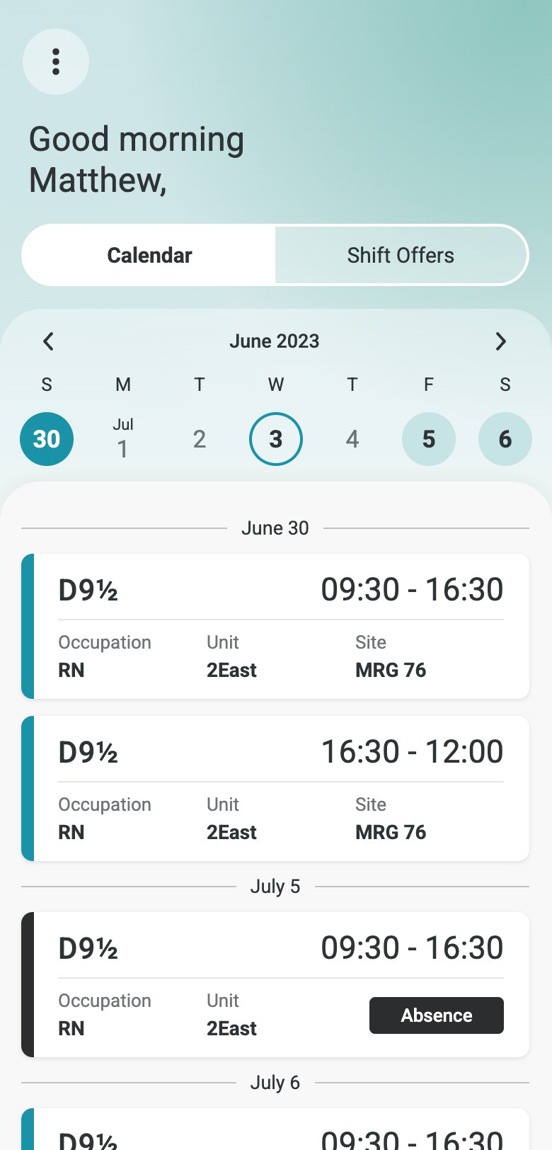
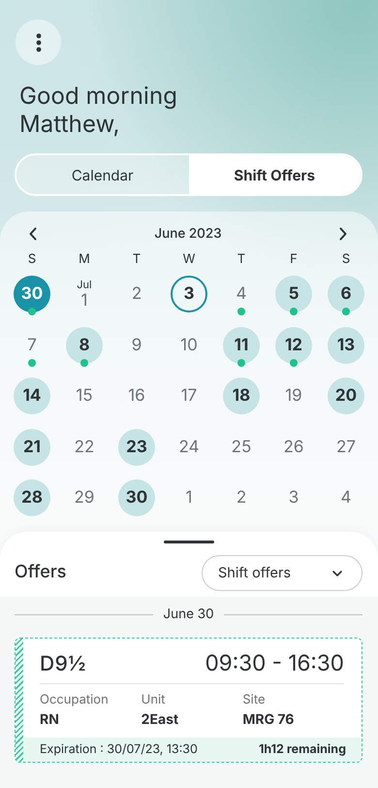
- Two views, one tap apart
Switch between the personal calendar and open shift offers.
- Week or month, one swipe away
The weekly strip expands into a full monthly view, with shifts and offers marked on each day.
- Key info first
Shift code and time on top; occupation, unit and site below.
- Status you can’t miss
Absences switch to a dark card with a clear label.
The product team wanted offers and the calendar in two separate sections, worried that mixing them would confuse staff. Research showed the opposite need: to decide whether to bid, staff had to see their schedule around the offer day. I treated it as a UI problem, keeping both in one view with a clear visual distinction between shifts and offers. The design convinced the team.
Trade-off: a more complex component to design, but faster, better-informed decisions for staff.
The main risk was confusion: the calendar shows offers and owned shifts with the same structure. Confirmed shifts and open offers use different colors, but they also differ in texture and shape to follow WCAG 2.1 accessibility requirements (Use of Color: color is never the only way to convey meaning). That way the difference is still clear for people with color-vision deficiencies, in bright sunlight or in grayscale.
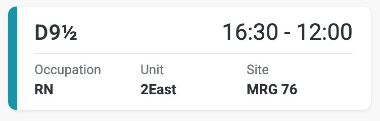
A confirmed shift, already in the employee’s calendar.
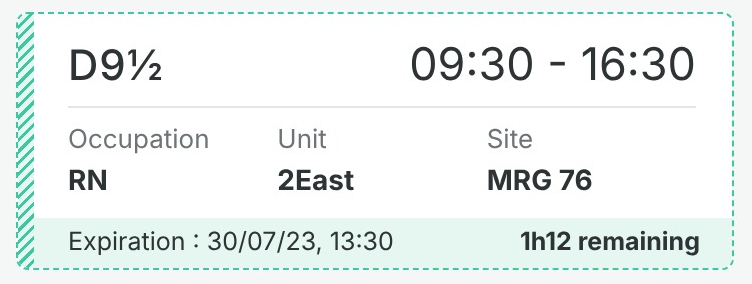
A shift offered to the employee, not in their calendar yet.
4Delivery – Implementing the mobile app
Development was handled by an external partner. I stayed in charge of design QA, supervising the build step by step so every release matched the designs and the experience we had validated with staff.
Impact on the organization
- Automated replacement process
- Fewer scheduling errors
- Fewer union grievances
- An easy, intuitive way to reach employees
- Higher response rates
- Fewer unfilled shifts and less overtime
Lessons learned
Designing for healthcare is another story
Many approaches that work in other industries don’t apply here. When patients are involved every second matters, and stressed staff on shift have little patience for digital tools. More than in any past project, I heard: “reduce the number of clicks.”
Complex systems are no joke
Healthcare in Quebec runs on hundreds of regulations. The biggest challenge was designing a calendar that respects every employee rule without becoming crowded or complicated.
Accessibility from the roots
Accessibility is often checked after the designs are done. Here, while the company was building it into its design process, we started from the design system itself, which smoothed the work and cut the iterations caused by failed tests later on.